
Client
DyeRecycle
Date Completed
July 2026
My Role
Value Proposition
Market Positioning
Visual ISPs
Company Rebrand
Exhibit Design
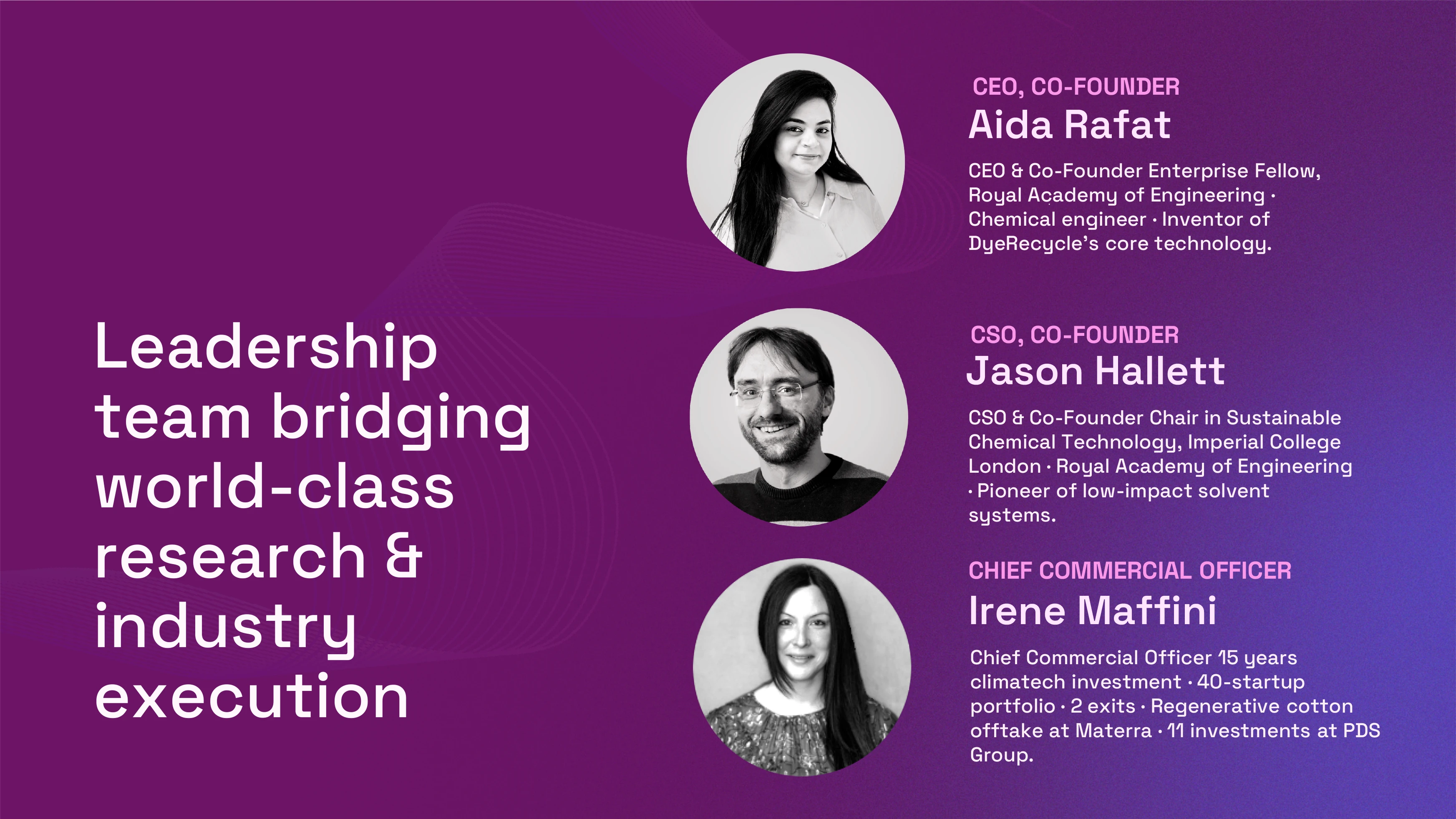
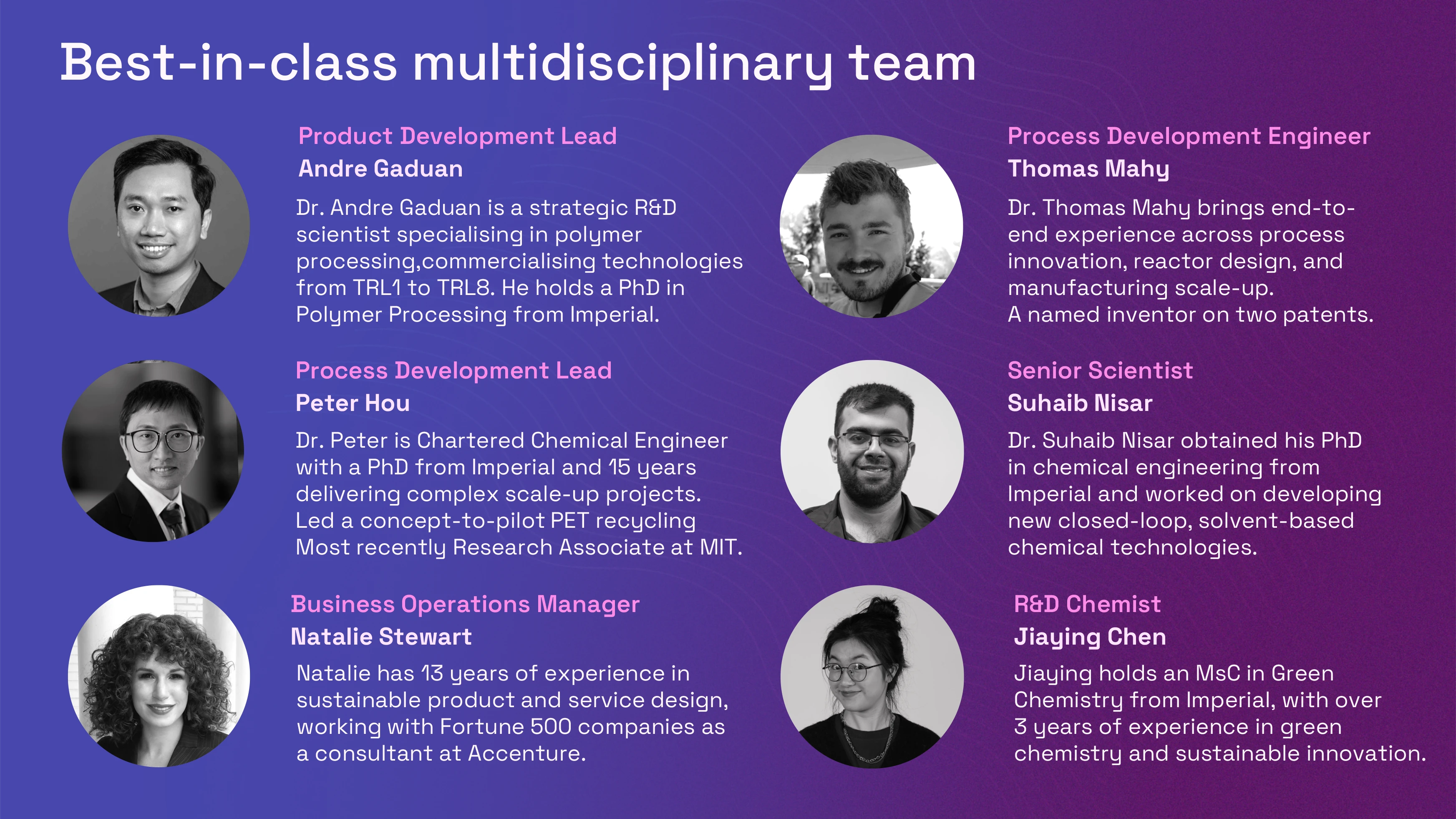
The Team Members
CEO
CCO
Chemical Engineer
Green Chemist
Fibre recovery startup DyeRecycle pivoted their core technology, but their go-to-market strategy and brand positioning was distracting potential investors. I restructured the company’s core ISPs and value proposition, rebuilding an entirely new brand architecture from pitch deck and website to physical conference exhibits, all while the product was still in active development.
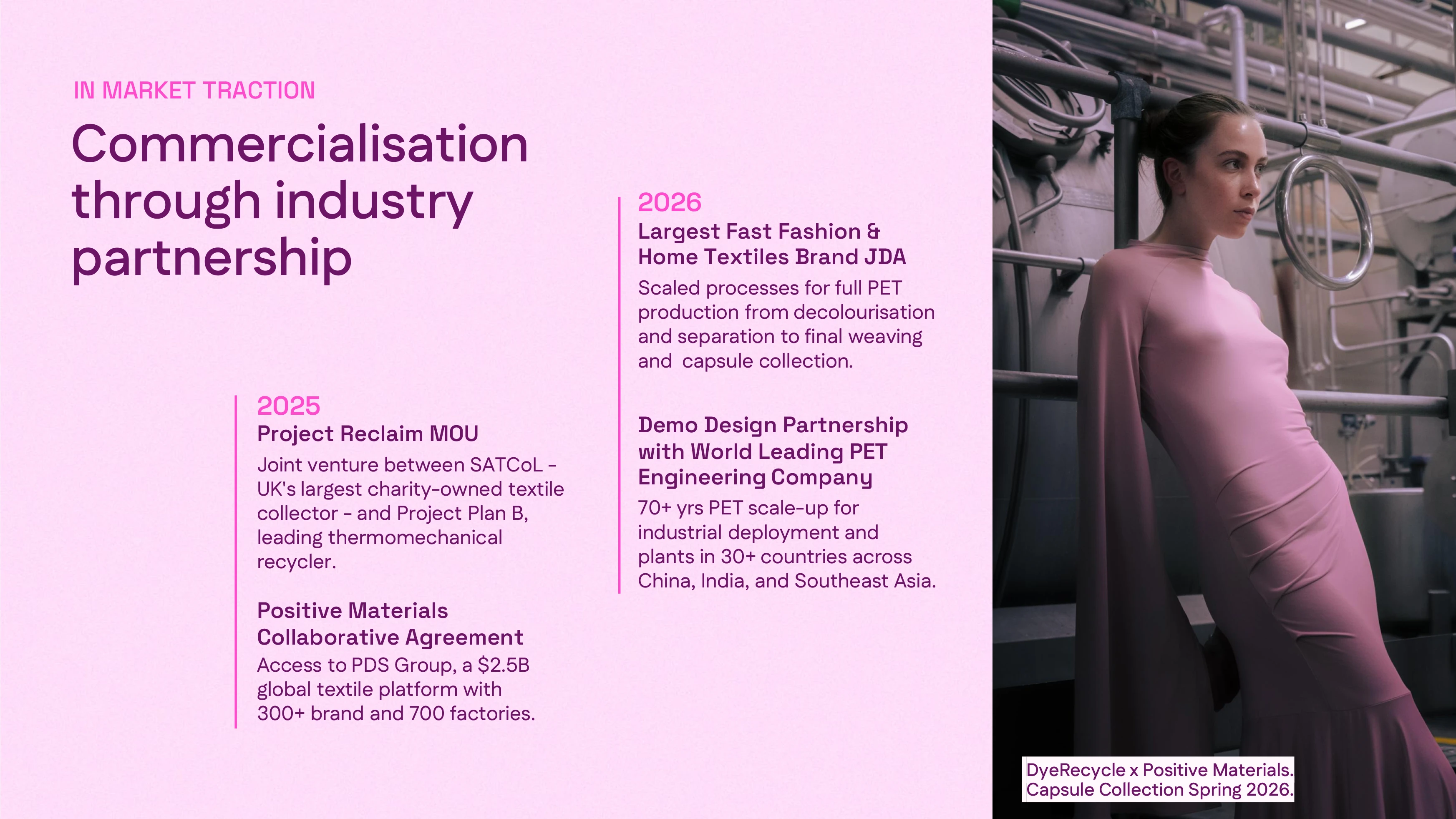
DyeRecycle’s £3 million Seed round had stalled, and they needed to rapidly present a clear vision of the company’s growth to close the needed investment. The ionic solvent startup had pivoted from recovering dye to cleaning waste textiles, but investors did not understand the technology nor integration in the supply chain.
I was the first non-technical hire, and no one had ever strategically evaluated let alone rigorously constructed the fundamentals of a well designed product platform. From vision and values to features, logo, color palette, typography, imagery style, tone, and every digital and print platform that entails, the company’s external footprint detracted from its exceptional innovation. With absolutely no time and the product formulation still in flight, I built the brand in real time, responding to live feedback from pitches, investors, and industry events. This was all while I managed hiring, a lab move, grant applications, and operational processes.
DyeRecycle was a giant red herring. The name set investors down the garden path, and potential customers couldn’t tell what the company actually produced. Was it a recycler that processed its own textiles? A new material manufacturer? A hardware technologist?
When everything feels like it’s on fire, I take three steps back. Where is DyeRecycle? Who are they not, and who should they be borrowing from? I combined our current competitive research with AI assisted scraping to analyse corporate websites, reports, recorded pitches and presentations, and press releases to understand the following questions:
How does the company describe their core product in one sentence?What are the 3-4 features of their product that make it unique?What problem do they solve? For whom?What verbal and visual imagery do they use?Why is this company different than its competitors? (This was more a test of AI capabilities).
At the same time, I did my own heuristic analysis of 8 different companies, noting key framing, phrases, and positioning to compare to the Claude results. …here talk about the results


DyeRecycle’s scrambled brand was equally a symptom of scrambled purpose. If my benchmark was outside in, I needed to turn the company inside out to understand why the company actually exists. I asked for two three-hour workshops to break down the fundamentals of brand, vision, and values. I was given one two-and-a-half hour time slot and a snack budget.
I started by building the team's visual-verbal confidence. I flashed a series of competitors’ landing pages on the screen, and each participant had to assign brand values from a set of descriptive cards. Every image also served as a quick primer on key design features, training them to notice details like white space, illustration style, and color grading. With an expanded sensory repertoire, our scientists then selected five words that did and did not describe the company, in addition to five images from my pre-selected references spread across the table.

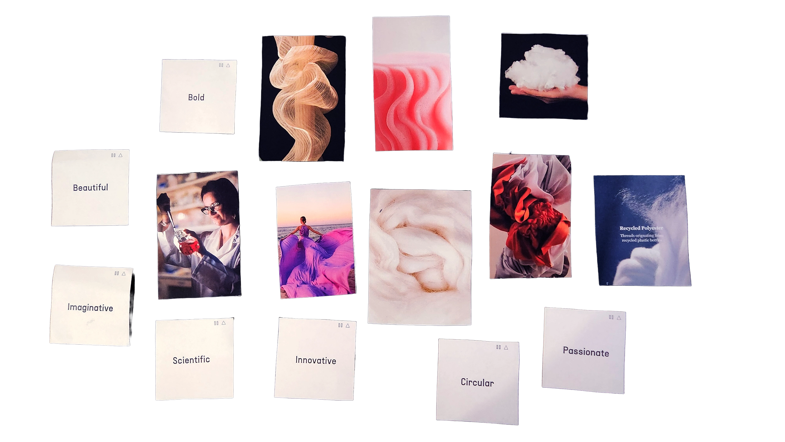
Playing right into my hand, several participants (most notably the CEOs) chose images which directly contradicted their selected words. Descriptors like edgy and reliable sat uneasily together, and images featured in beauty campaigns were paired with words like precise, straightforward, and engineered.
I asked the CEO to envision a product her palette might be advertising. She laughed, and I could see the exercise had worked. “This makes no sense, does it? Am I schizophrenic? Why do I like all of these different things?” And there was the company’s brand laid bare, so I wiped the slate clean.
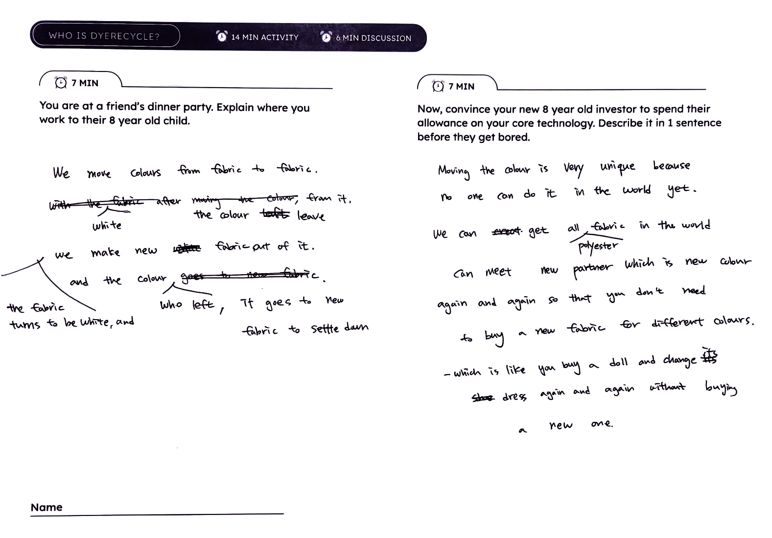
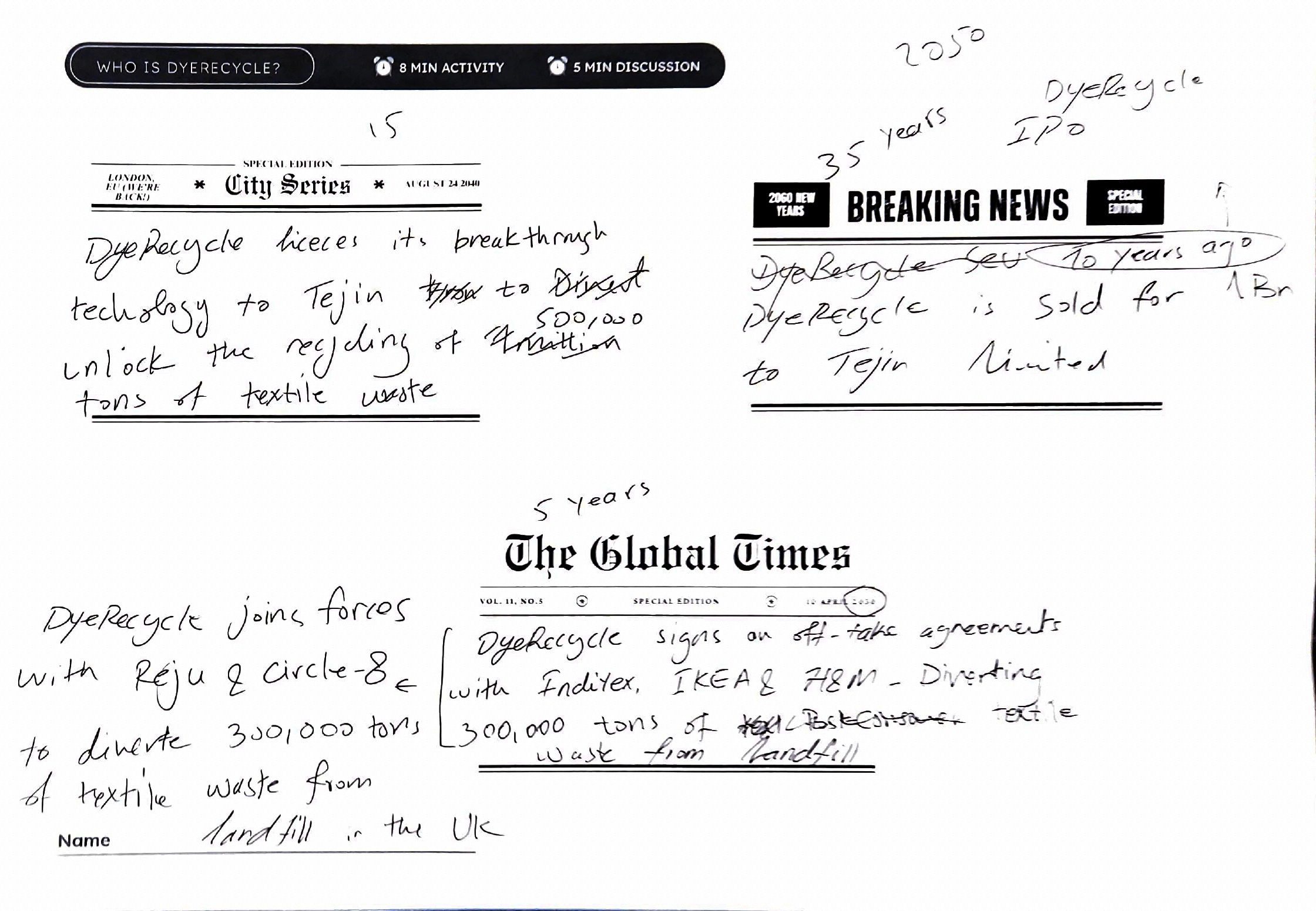
Can you describe what you do in the simplest language? To a very impatient customer? Try it on an 8 year old like our scientists during the workshop.
So what was left? Well, my direct attempts at understanding team culture had flailed (DyeRecycle’s 10 Commandments went down in awkward silence), but as my shy engineers tentatively argued for ‘their own’ values, for the first time all day, I caught small snippets of why they actually came to work. “We constantly try new things. We always question, we never know or settle for right now.” It was a crack of shared purpose, and a rich territory to shape who the company is. We could finally get to a few more reflective exercises, and some of the 2030 headlines were pretty bold and futuristic, now strong contenders for values!


We show up with color, declarative statements, and design-forward imagery.
We use wit, puns, and humor when appropriate to be accessible.
We speak and look toward future problems with future answers without losing touch with present realities.
We care about everything that we put out in the world.
We are precise and rigorous with our research, and our North Star is always the lab.
We never lose the pubic in jargon. We use clear and simple language without getting bogged down in sustainability terms.
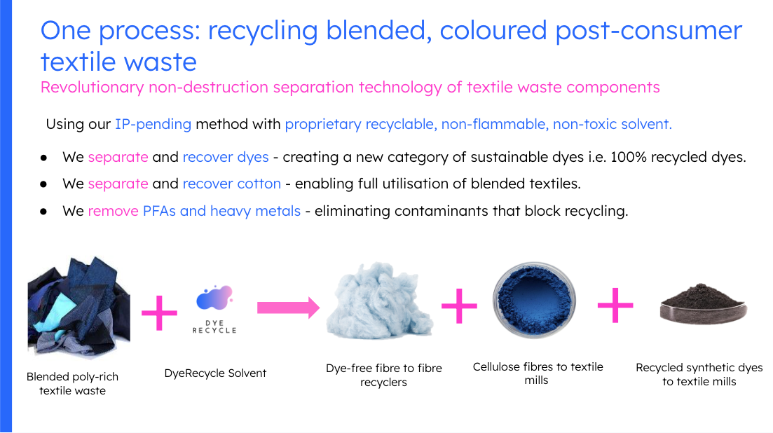
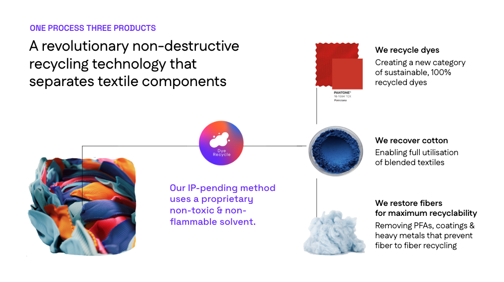
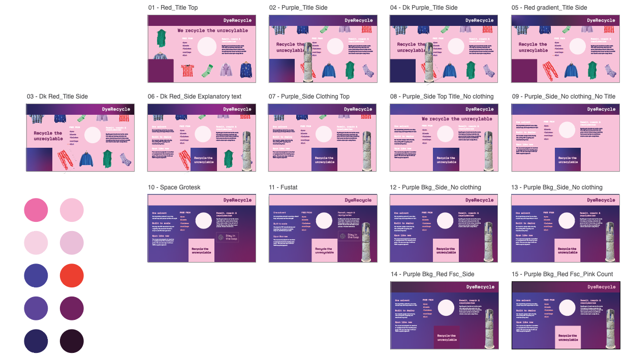
The original Powerpoint slide (top) and my first iteration (bottom) got bogged down in outputs versus outcomes.
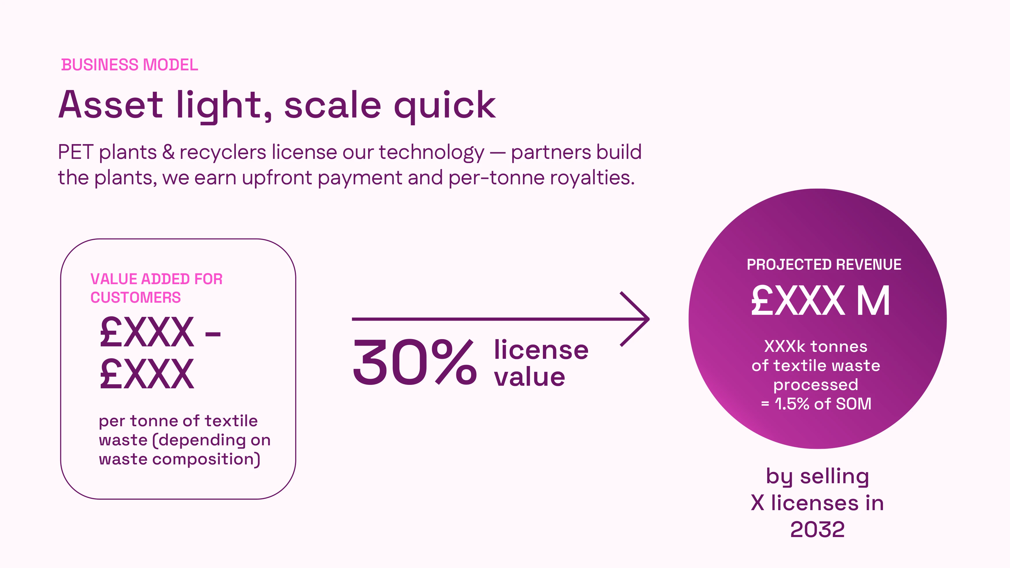
Bolstered by a short research sprint, I returned to the pitch quagmire. Until this point, DyeRecycle drowned investors in outputs. Product descriptions highlighted physical materials recovered, which were packaged as the ‘triple stream revenue’ of polyester, cotton, and dye. But DyeRecycle was selling a chemical solvent, and in fact because of its licensing model, it was actually selling its processes, operating conditions, and service set up. Decolored fibre is not even a recognized commodity in textile manufacturing.
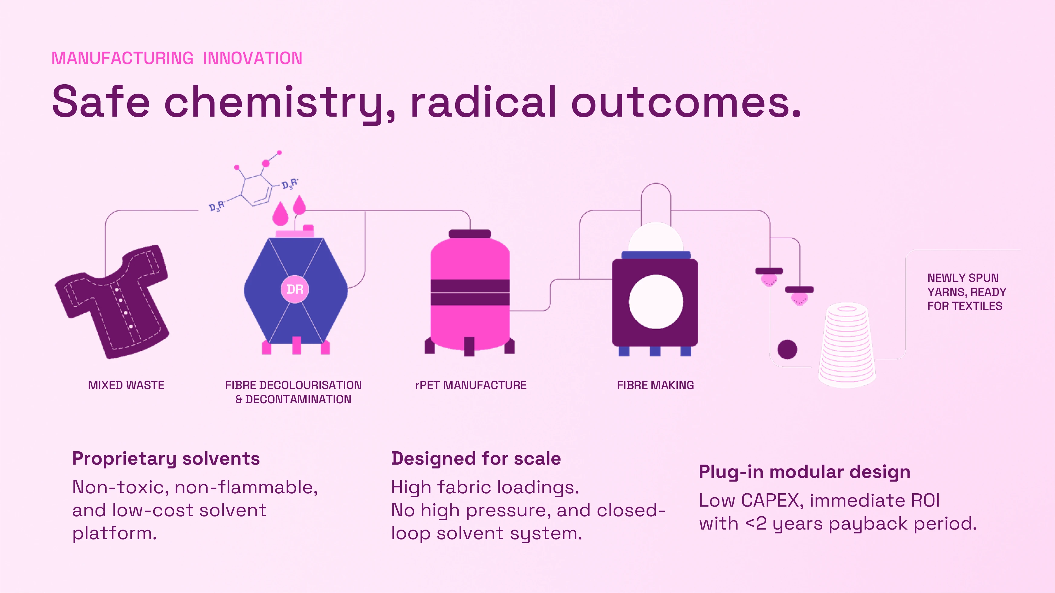
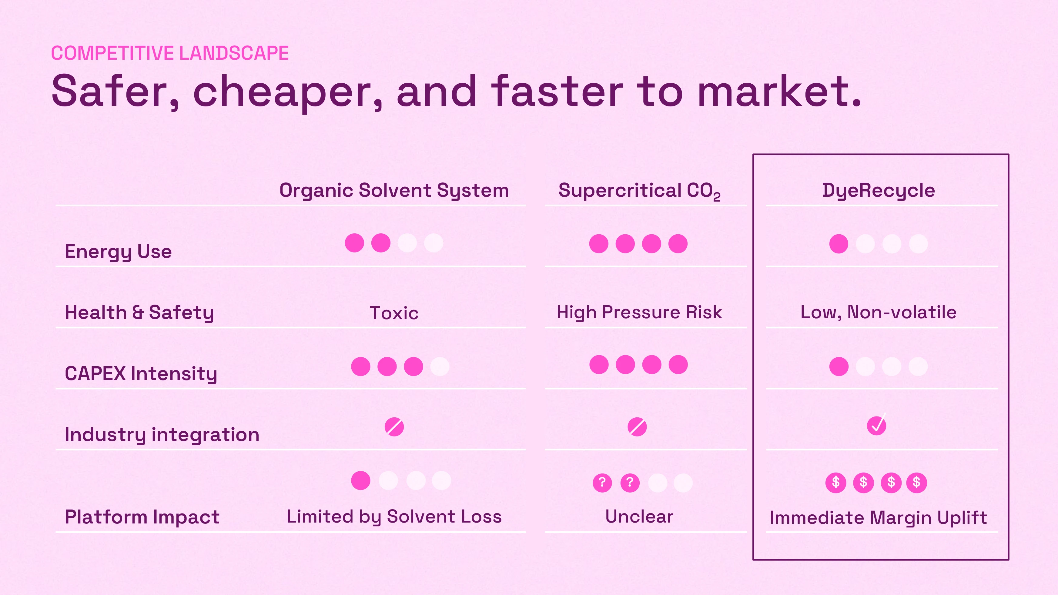
So what are DyeRecycle’s actual unique selling points? Within the short list of companies at the frontier of dissolution recycling, DyeRecycle’s entire process was quite simply, simple. It required one solvent which was low cost, easy to fabricate, and entirely safe to use. By contrast, competitors offered flammable and highly toxic solvents, at best relying on highly pressurized (read: explosive) and very expensive supercritical CO2.
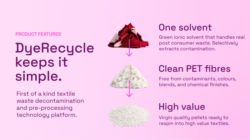
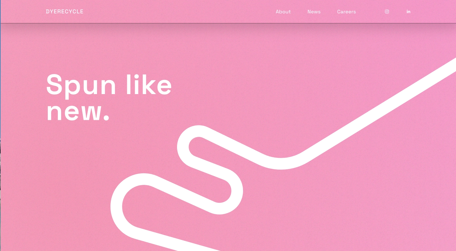
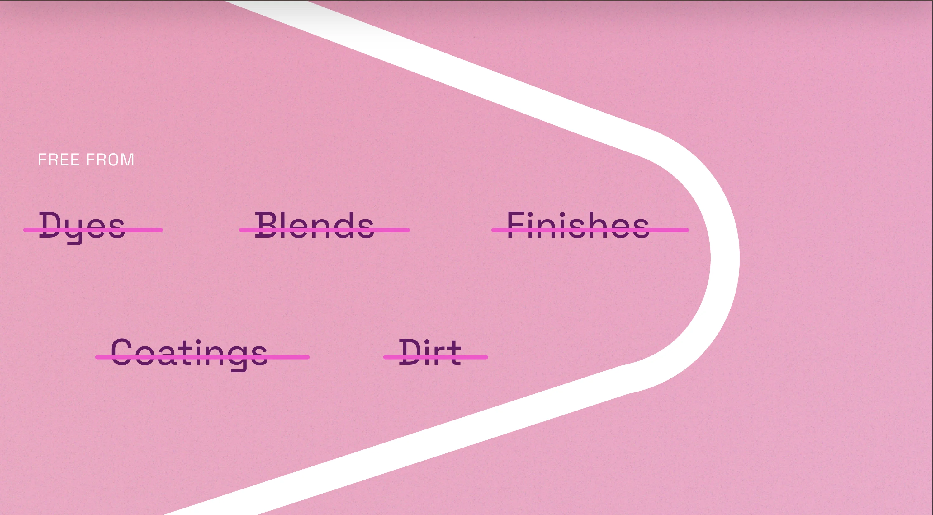
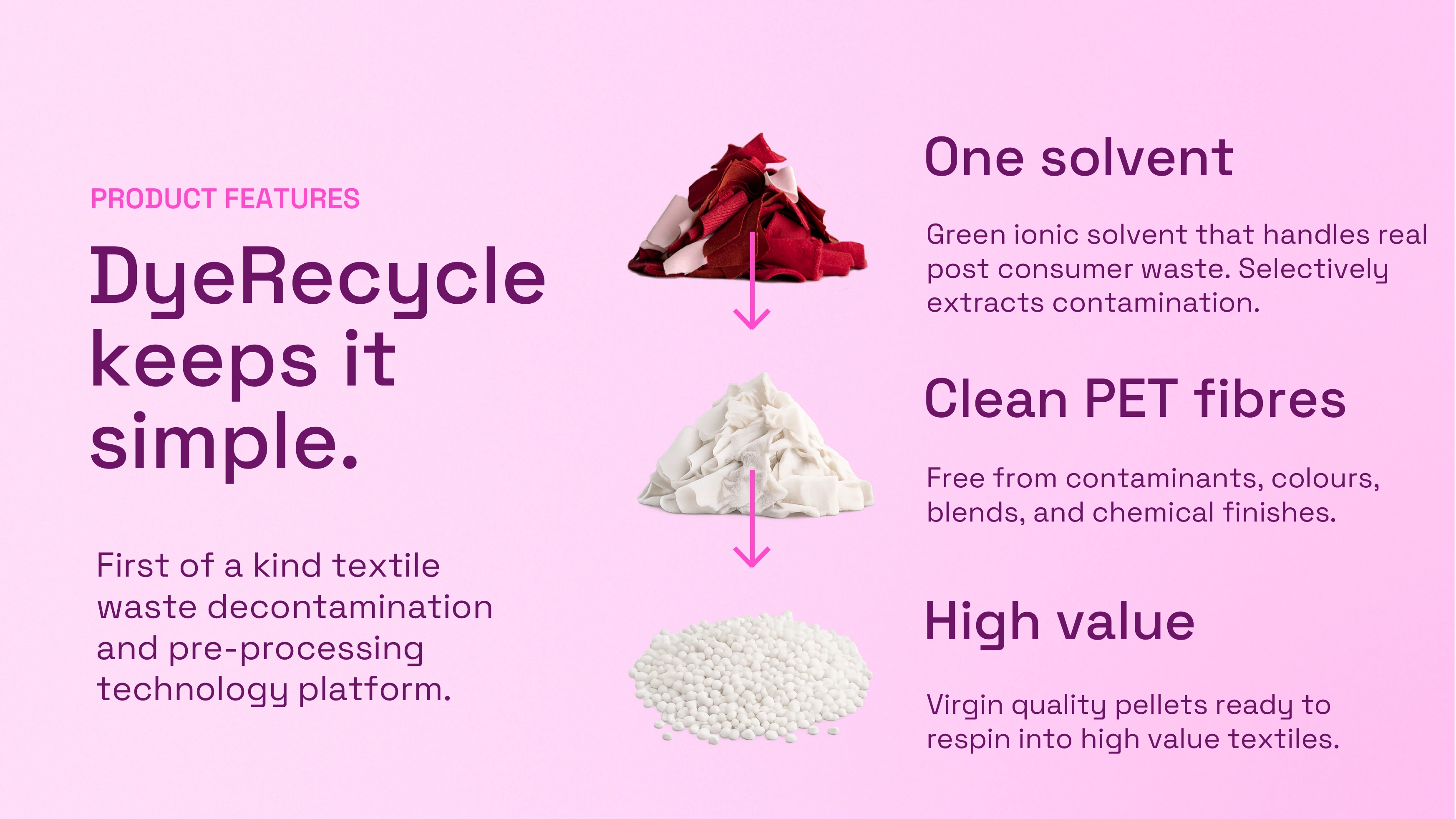
My linguistic playground borrowed from clean beauty. DyeRecycle produces fibre that is free from, removing colors and blends to reveal clean threads ready to be respun. I carried this message into our MVP website by animating one white fibre which follows the reader as the company’s narrative progresses.
By contrast, DyeRecycle lives in a world of complexity. It uses real world waste that is messy, mixed, and overflowing. And no one can sell it. In keeping with the spirit of transparency, I sidestepped most omnipresent sustainability jargon in favor of directness. As opposed to emissions reductions, I talked about using unusable waste. Instead of circular economy, I emphasize remaking, reusing, and preventing waste in our processes. There are enough buzz words to flag the crusaders, but the everyday technicians and recyclers who make up the lionshare of DyeRecycle’s customer base won’t be distracted by environmental evangelising.
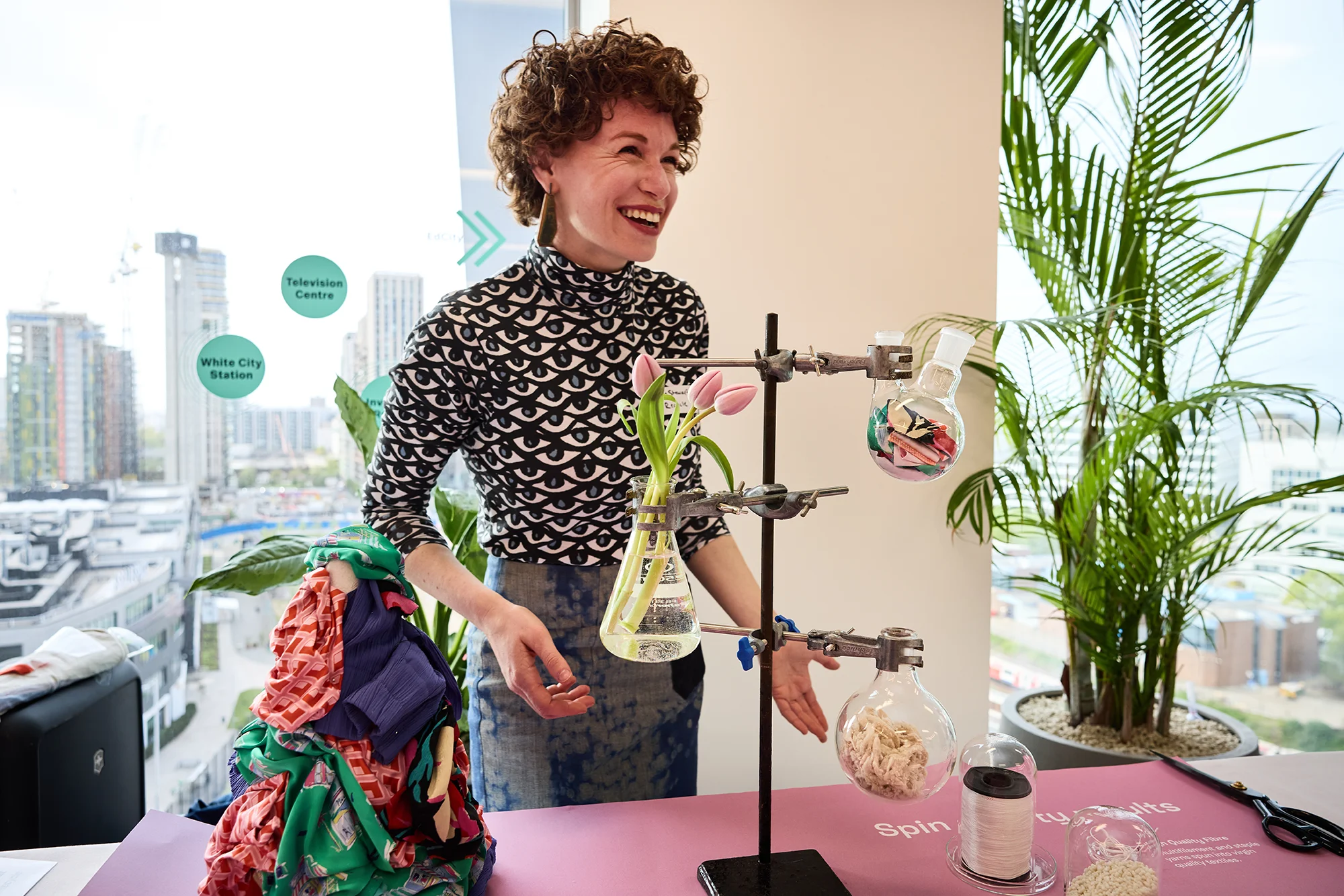

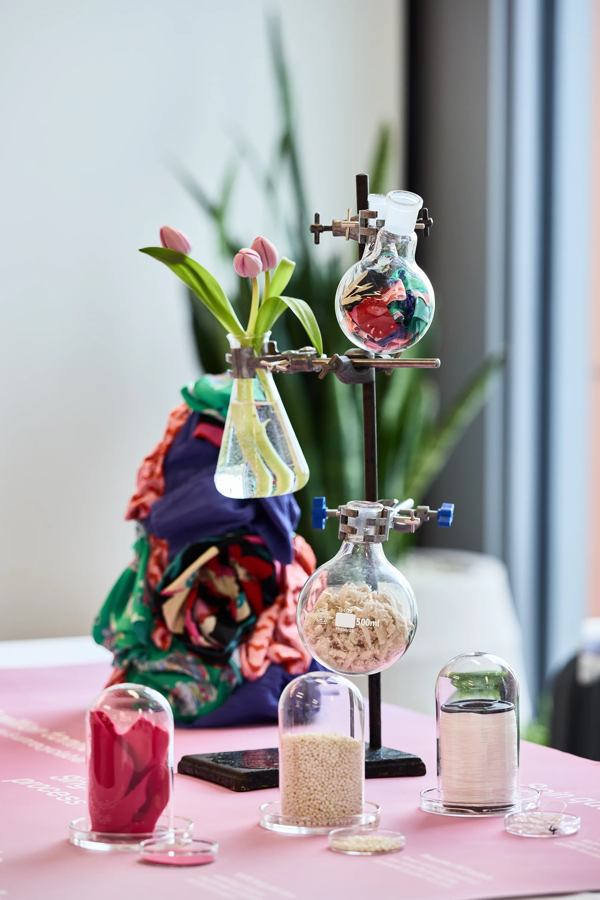
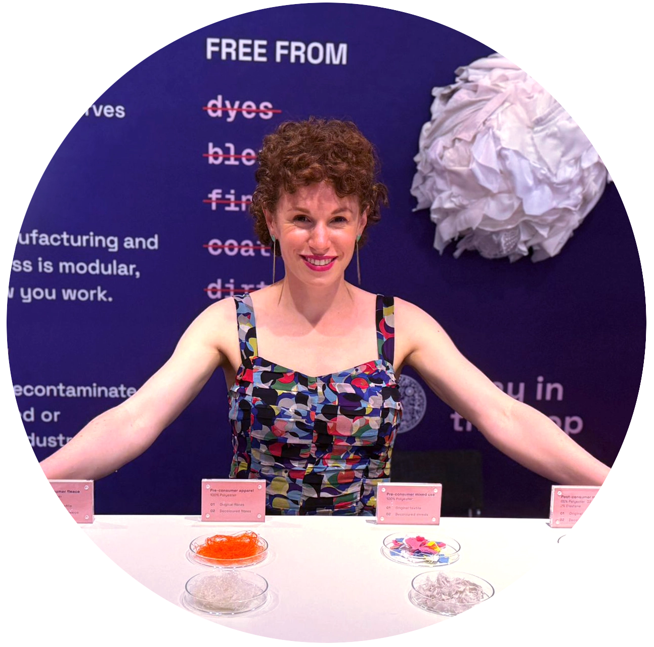
Above: My trial setup at a sustainable fashion showcase. Below: Describing our problem in the MVP exhibit table .
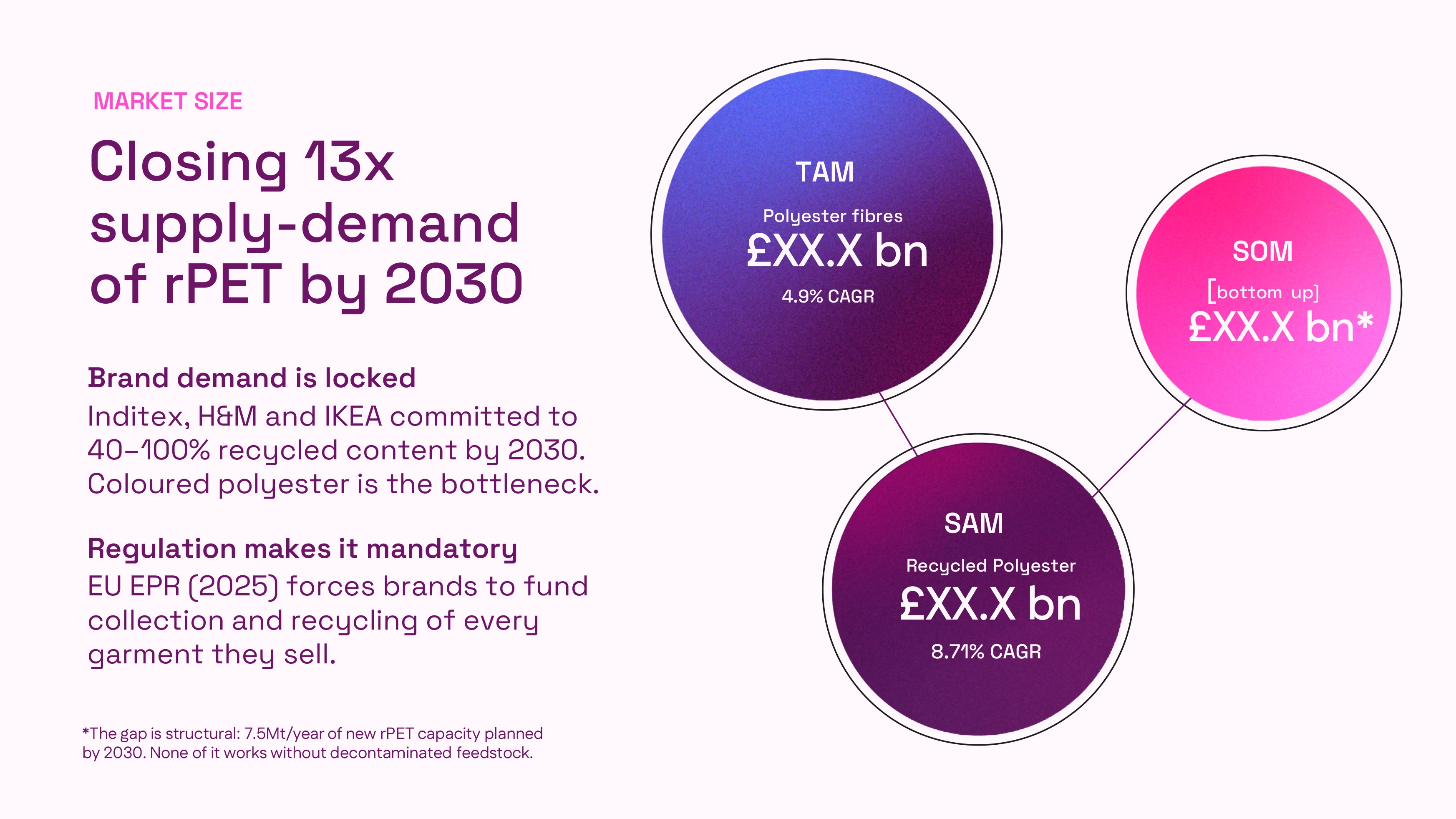
With no time for extensive customer interviews, I took every pitch, due diligence questionnaire, and technical review as data for development. A consistently weak part of the pitch was the initial problem scope. Investors were not responding to the more general waste framing, and the market focus of bottle economics lost interest. I took the opportunity to test a more direct approach and my evolving color palette at a fashion tech media event early on in the rebrand.
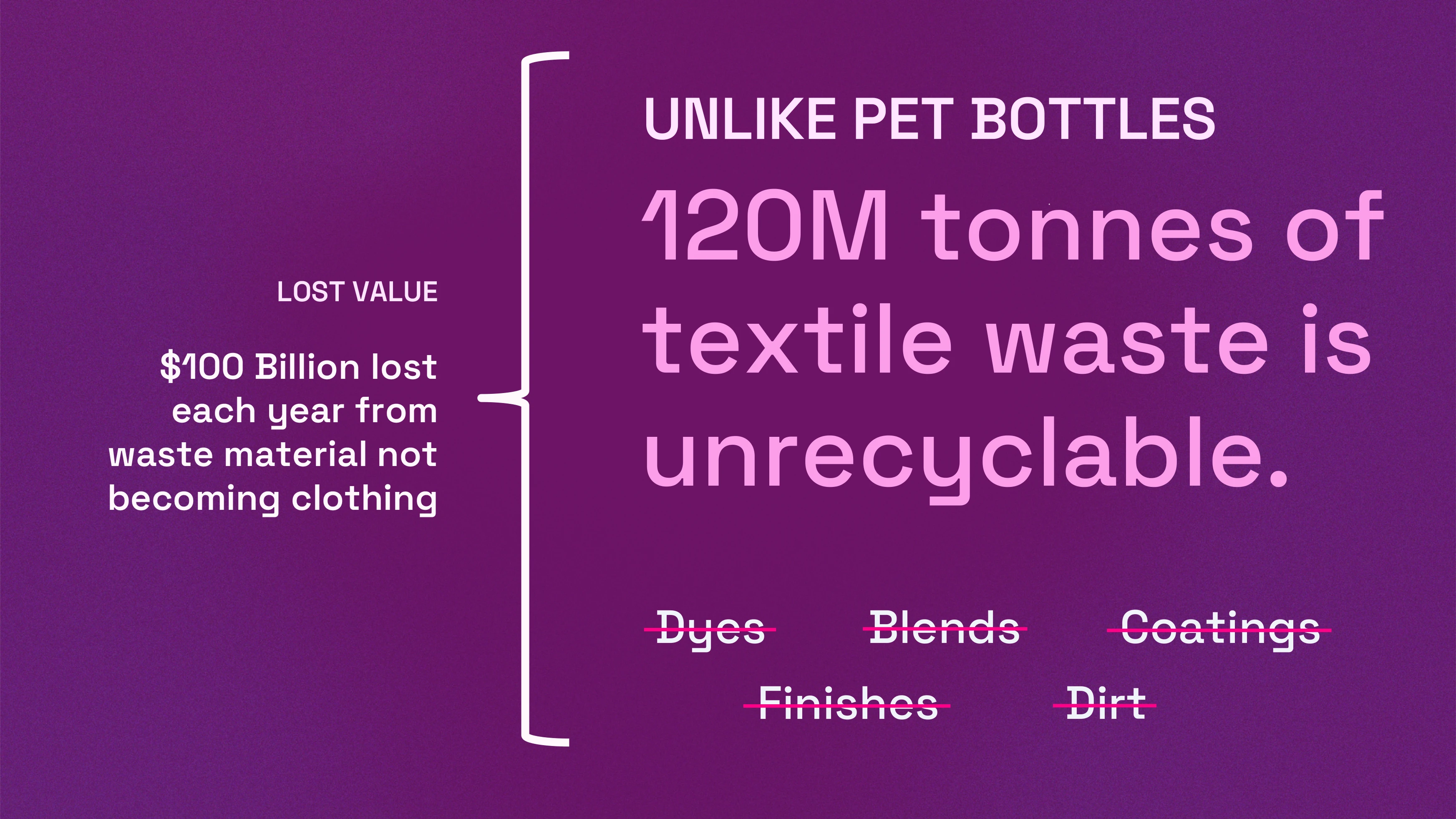
My general rule of thumb for copywriting is, write like no one cares what you are talking about. This also applies for exhibit design. Indeed, most setups that I scouted suffered from over information at one visual depth. Basically, a flat table with lots of printed signs. In this quick £15 set up, I constructed a small fabric mountain of unrecycled waste, while journalists could pick up pieces of waste clothing sorted by the dyes, blends, and coatings that send their favorite clothing to the garbage. These are the burn down the house problems that absolutely every brand, recycler, and PET manufacturer cannot manage. So why not just say it?


My general rule of thumb for copywriting is, write like no one cares what you are talking about. This also applies for exhibit design. Indeed, most setups that I scouted suffered from over information at one visual depth. Basically, a flat table with lots of printed signs. In this quick £15 set up, I constructed a small fabric mountain of unrecycled waste, while journalists could pick up pieces of waste clothing sorted by the dyes, blends, and coatings that send their favorite clothing to the garbage. These are the burn down the house problems that absolutely every brand, recycler, and PET manufacturer cannot manage. So why not just say it?
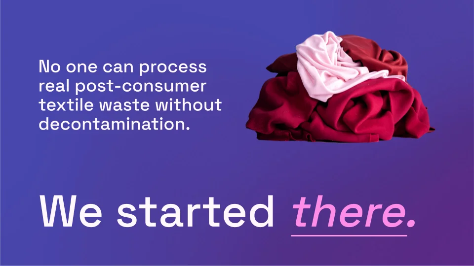
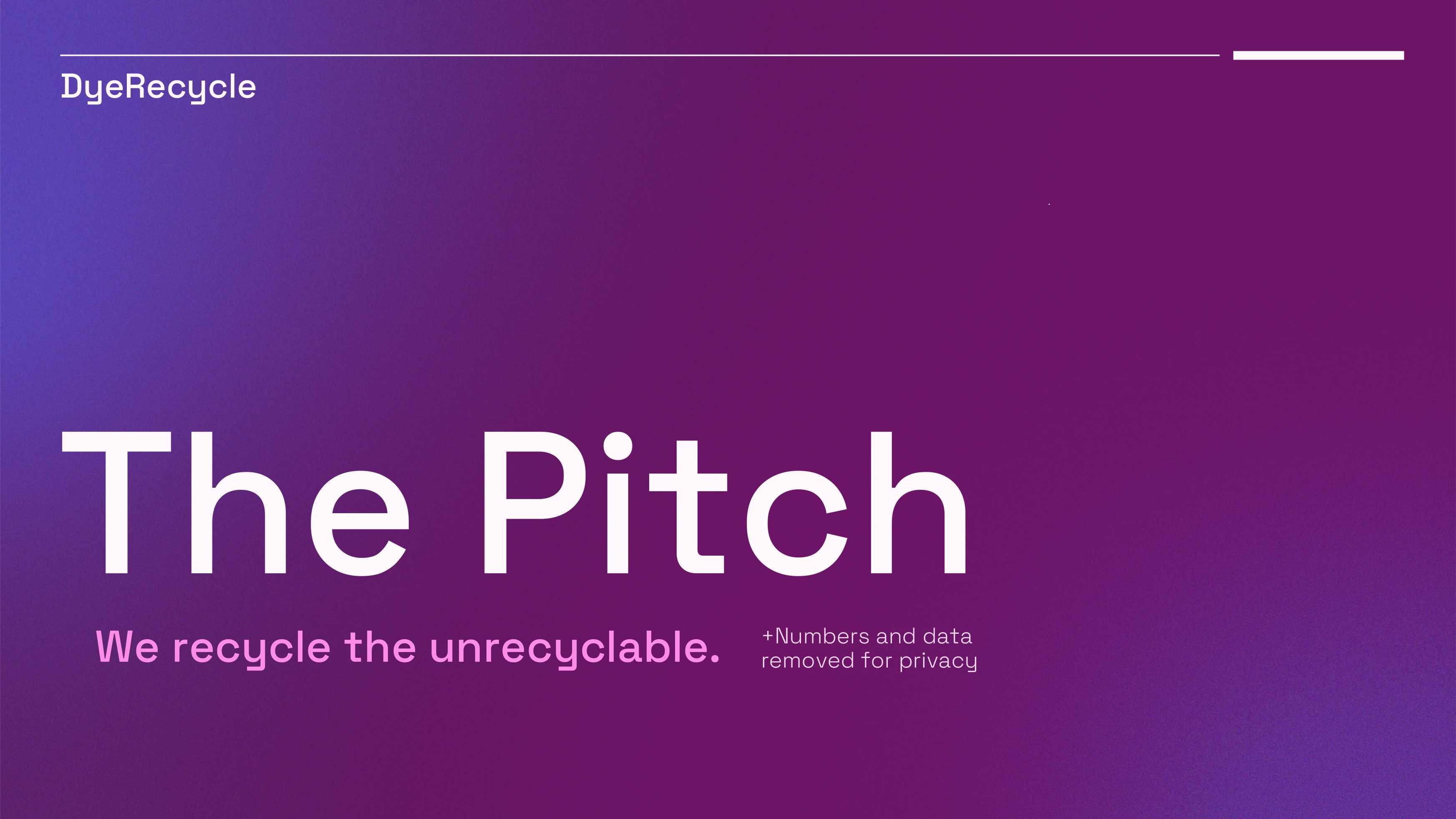
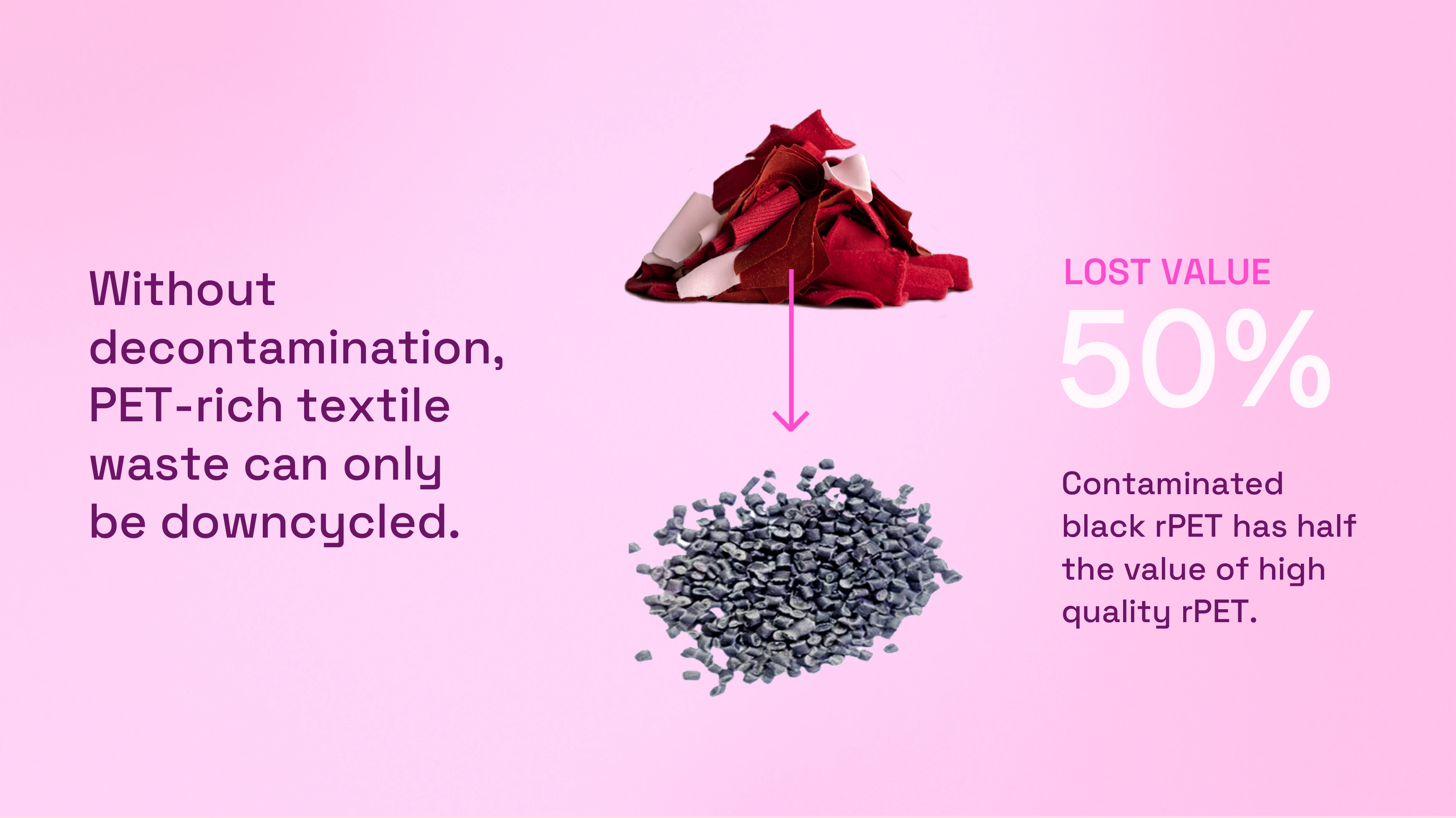
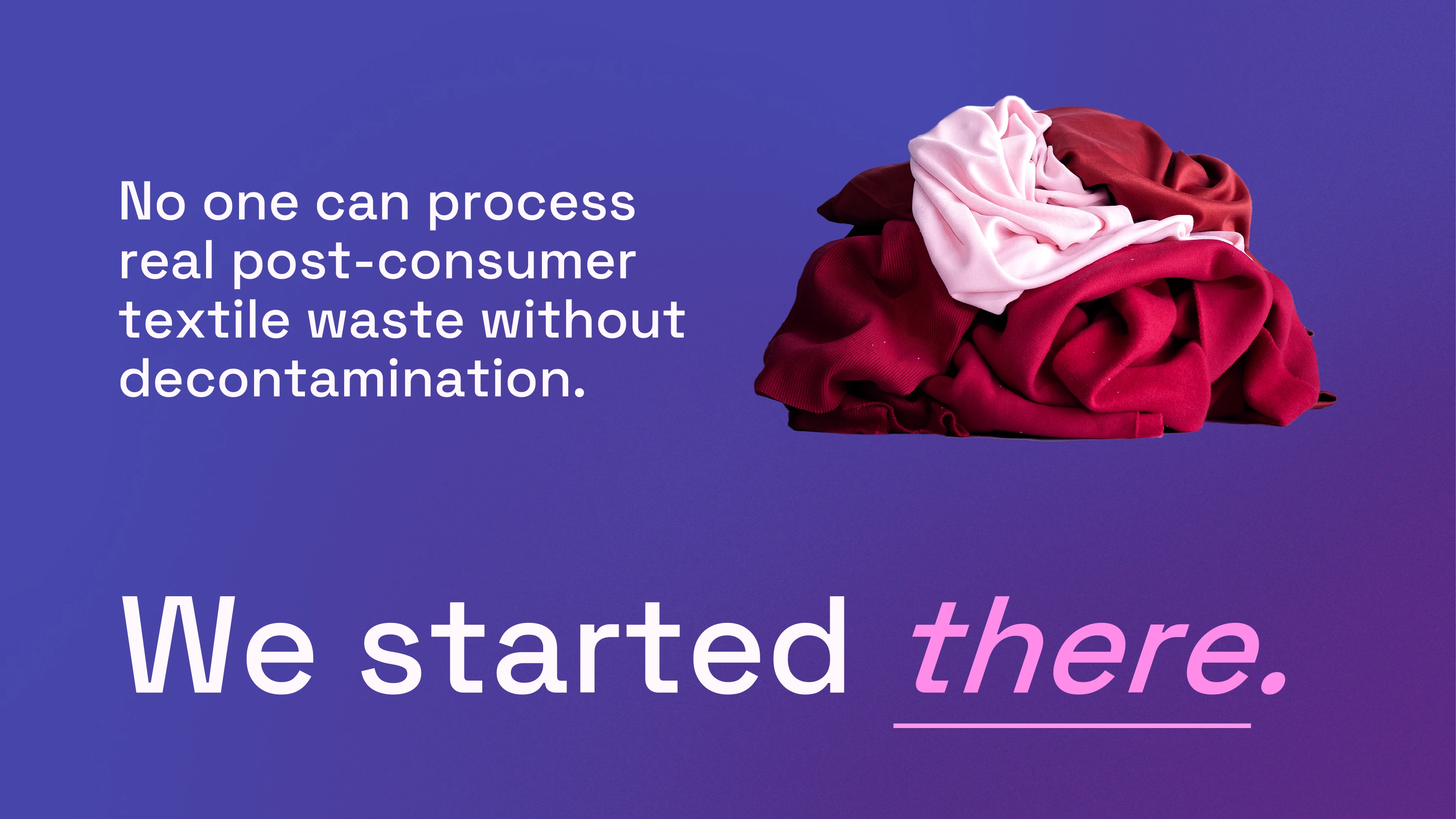
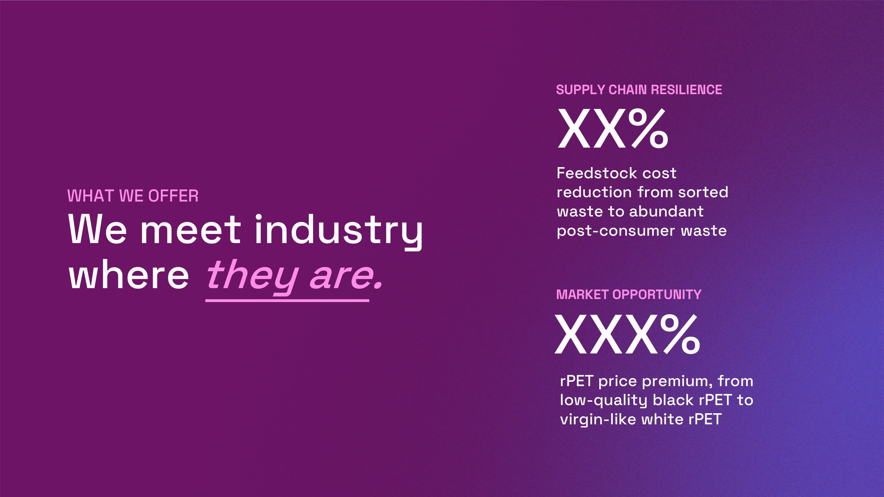
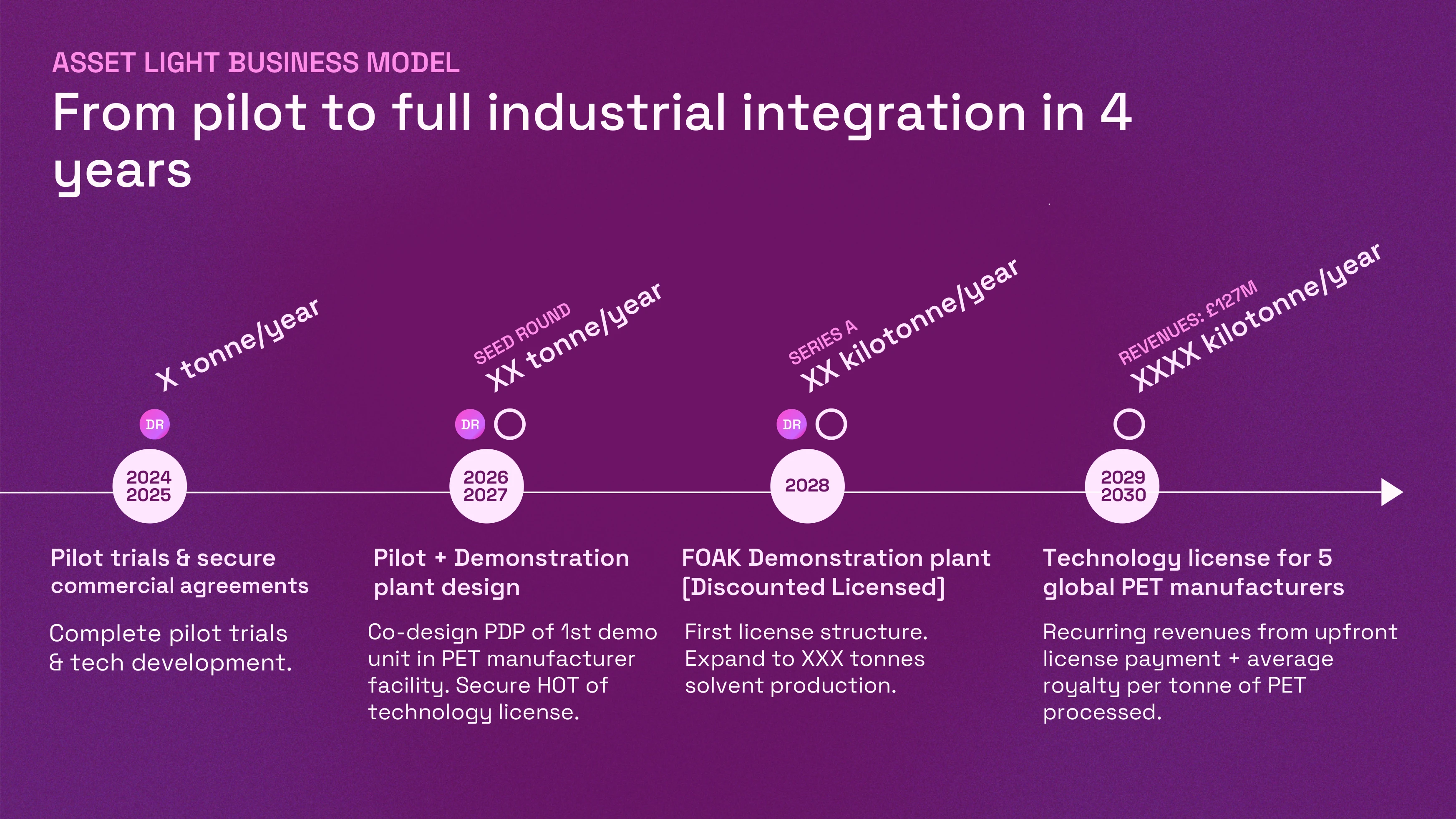
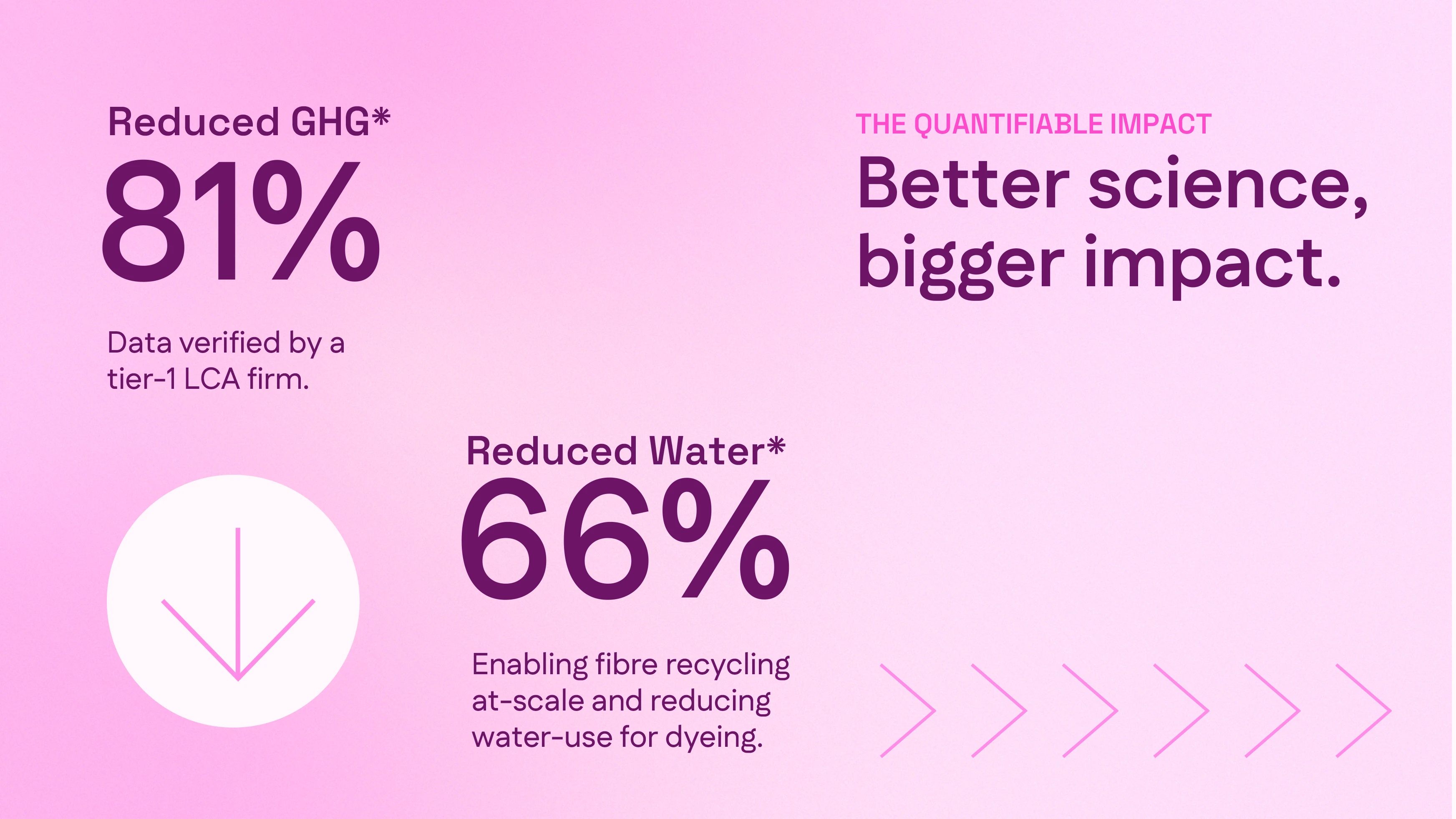
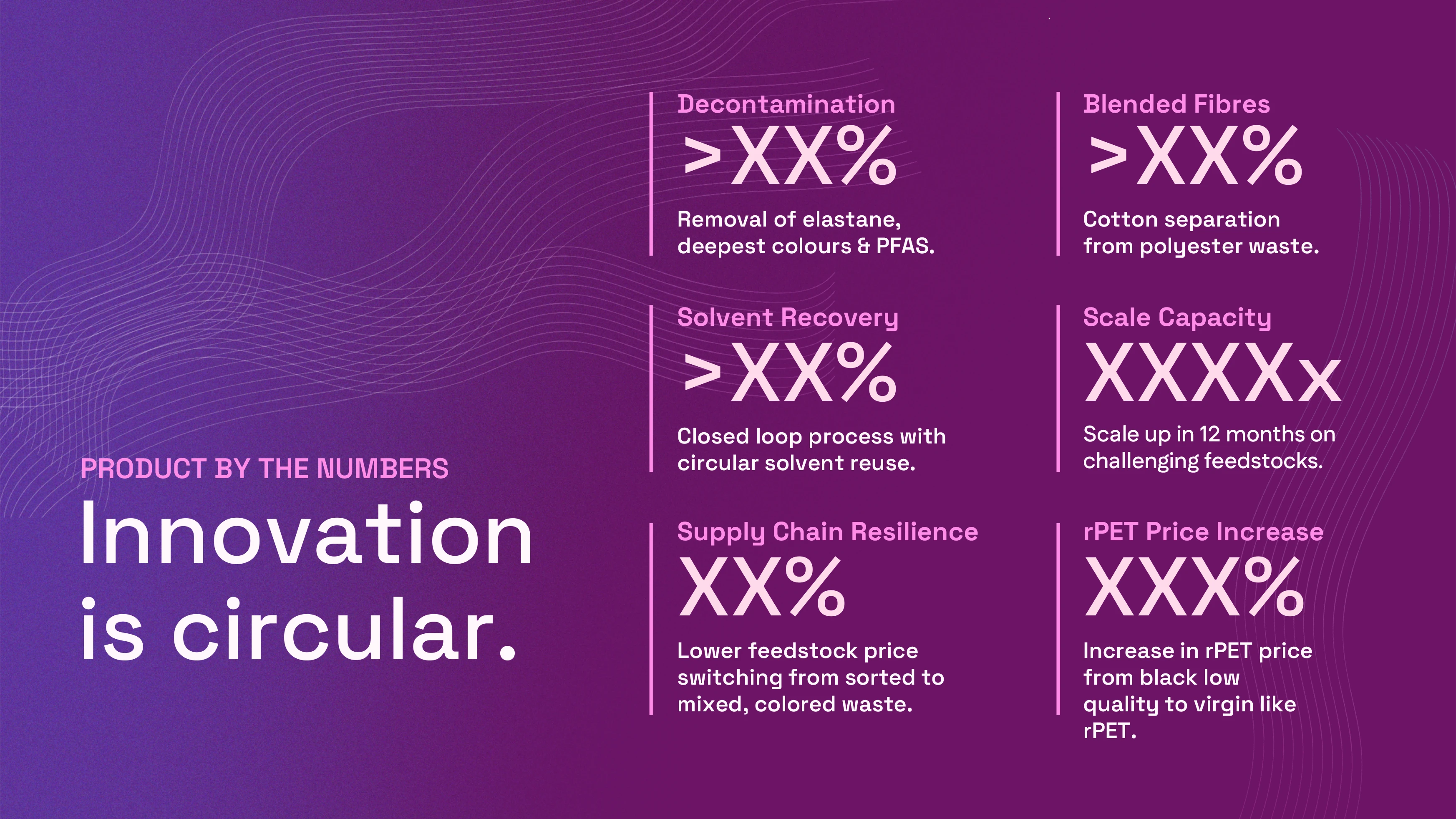
Left: The declarative full stop to our problem statement in the final pitch deck. Below: Our process and impact visualised with the new brand values in mind.
There is nothing like looming print deadlines to force decisions. The pitch decks had gone through more than 25 iterations, and I was sprinting to finish our mini website and spec all of the exhibit supplies before we showcased at the Textile Recycling Expo in Brussels. We went back and forth on the language countless times, a tension which I can reduce to technical versus accessible. Words like decontamination and non-destructive kept coming back into drafts, and our leadership team questioned the fine line between accuracy and simplicity. Can you say no waste if 1% solvent is lost in the process? Can you discuss all textiles when it’s really polyester and blends above 50%?
The final polish required weeks, but this was only 30-40% of my job. I was also managing a visa audit, organising our lab move, onboarding 2 new hires, and anything else that happened to become business imperative. There were no metrics for evaluation nor boundaries of responsibility, and I was drowning. At the same time, the R&D team was racing to validate the final chemical composition, which would set the course of product development for at least the next 5 years. The details needed to be finetuned, but not without the entire foundation crumbling.
There is nothing like looming print deadlines to force decisions. The pitch decks had gone through more than 25 iterations, and I was sprinting to finish our mini website and spec all of the exhibit supplies before we showcased at the Textile Recycling Expo in Brussels. We went back and forth on the language countless times, a tension which I can reduce to technical versus accessible. Words like decontamination and non-destructive kept coming back into drafts, and our leadership team questioned the fine line between accuracy and simplicity. Can you say no waste if 1% solvent is lost in the process? Can you discuss all textiles when it’s really polyester and blends above 50%?
The final polish required weeks, but this was only 30-40% of my job. I was also managing a visa audit, organising our lab move, onboarding 2 new hires, and anything else that happened to become business imperative. There were no metrics for evaluation nor boundaries of responsibility, and I was drowning. At the same time, the R&D team was racing to validate the final chemical composition, which would set the course of product development for at least the next 5 years. The details needed to be finetuned, but not without the entire foundation crumbling.
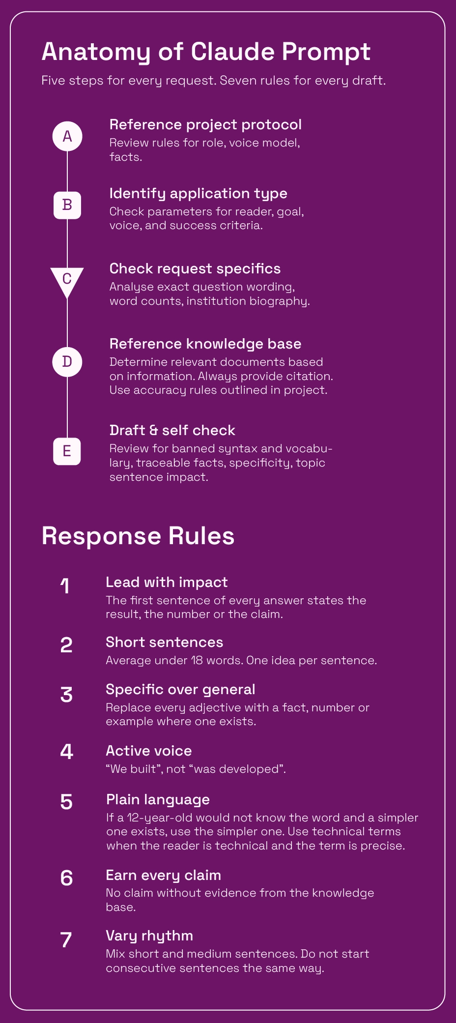
I will be the first to admit that I am not used to passable quality. I worked for big clients who expect polished outcomes, even when you are workshopping ideas. Exactly what fidelity is needed at what time is a skill, and one that I needed to sharpen quickly. I created a Claude Project that contained the best applications and branded materials that I had written with my human brain, with a set protocol to control factual reporting, syntax, and voice.
Each document type such as VC onboarding surveys or government applications has a sub set of rules which control reader, goal, and success metrics. These responses did not need to be works of art, and I edited them three times faster than writing (especially when tired). Key technical documents like visa applications I validated through outside experts, which was more rigorous than anything I could attempt.
Since I was a team of one, I also experimented with ways to expand access to my work. I built a fill-in-the-blanks UI for our new custom coded newsletter, which allowed anyone to move content, change buttons, and customize photos, all without touching a line of code. I also created a searchable Claude code repository to explain how to edit our newly built website. Time and budget constraints had required me to continue using Squarespace, so I had inserted many pieces of custom CSS and JS bring the website to life. The Claude database explained how to make key edits, where to find the code, and what features could be changed.

Bottom: It's not the most intuitive UI, but 3 hours later, you can give our newsletter a play! Right: The searchable code repository.
All of my tests converged on the Textile Recycling Expo, our largest sales opportunity for the year. From every showcase, pitch competition, and customer meeting, I had determined that the product is the impact. The solvent need not be visualised to grasp the power of the technology. We had perhaps 30 seconds to one minute to explain what we do, and no diagram nor model would stop a manufacturer in their tracks. We needed to put the proof right in front of their eyes.
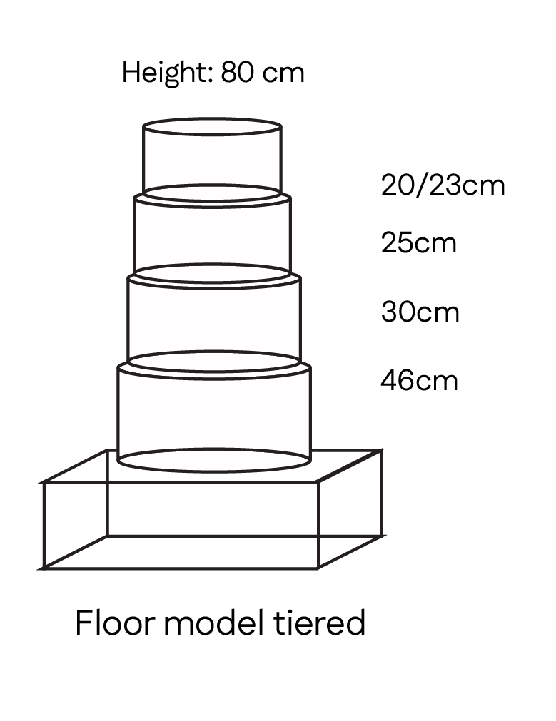
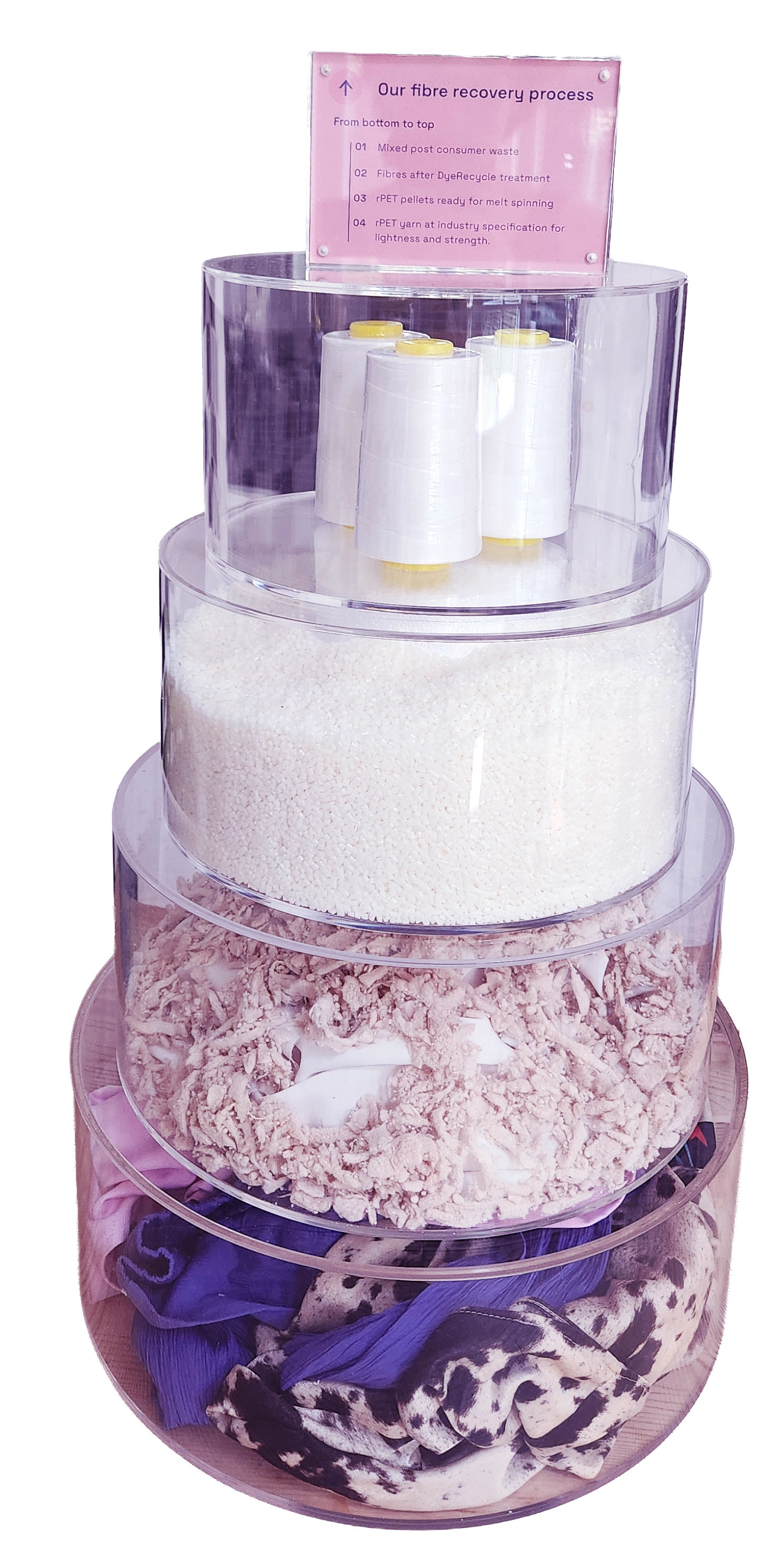
Here was born the fibre tower, an 80cm acrylic stand which showed in four steps how DyeRecycle cleans textiles. Though I initially explored some custom designs with Imperial’s Hack Space, time dictated an off the shelf, easy to assemble approach which could be packed into suitcases on the Eurostar.


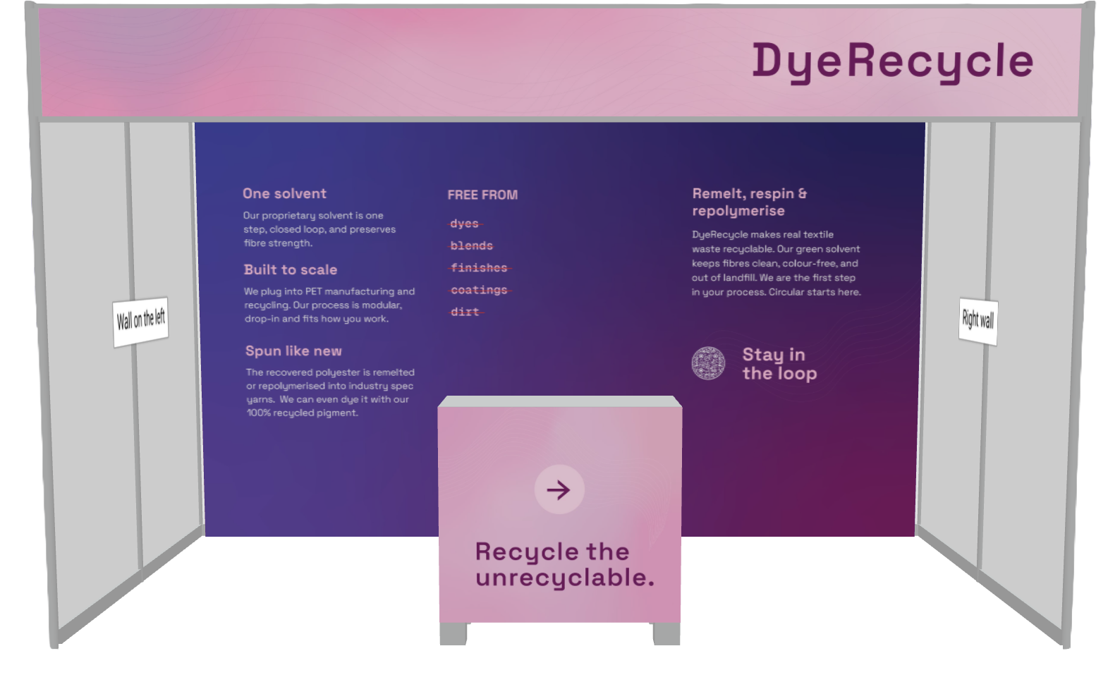
To understand how someone would move through the information, I mocked up the full size exhibit in washi tape across my living room. Type size and reading height was tested on A3 print outs, while I scaled household objects to spec prop size. The signage could block key text at certain display angles, and we had a prominent counter and table which also determined data spacing and margins.
Right: The counter featured an unusual color and declarative statement. Below: Testing different information hierarchies, phrasing, layouts, and colorways digitally while simultaneously running living room experiments for flow and readibility.

The expo had already launched in the US, and LinkedIn was flooded with photos of this giant colorful elephant made of recycled textiles. I had been sketching different 3D displays for the backdrop, ranging from a giant white fibre weaving to an art gallery of decolored clothing. Ultimately, we needed to keep the budget low and assembly reusable for future events. I sculpted a giant ball of white textiles from our testing remnants, using a half styrofoam form to keep it light but prominent. More than our name, more than a claim, you would see a giant ball of clean, white, fibres.

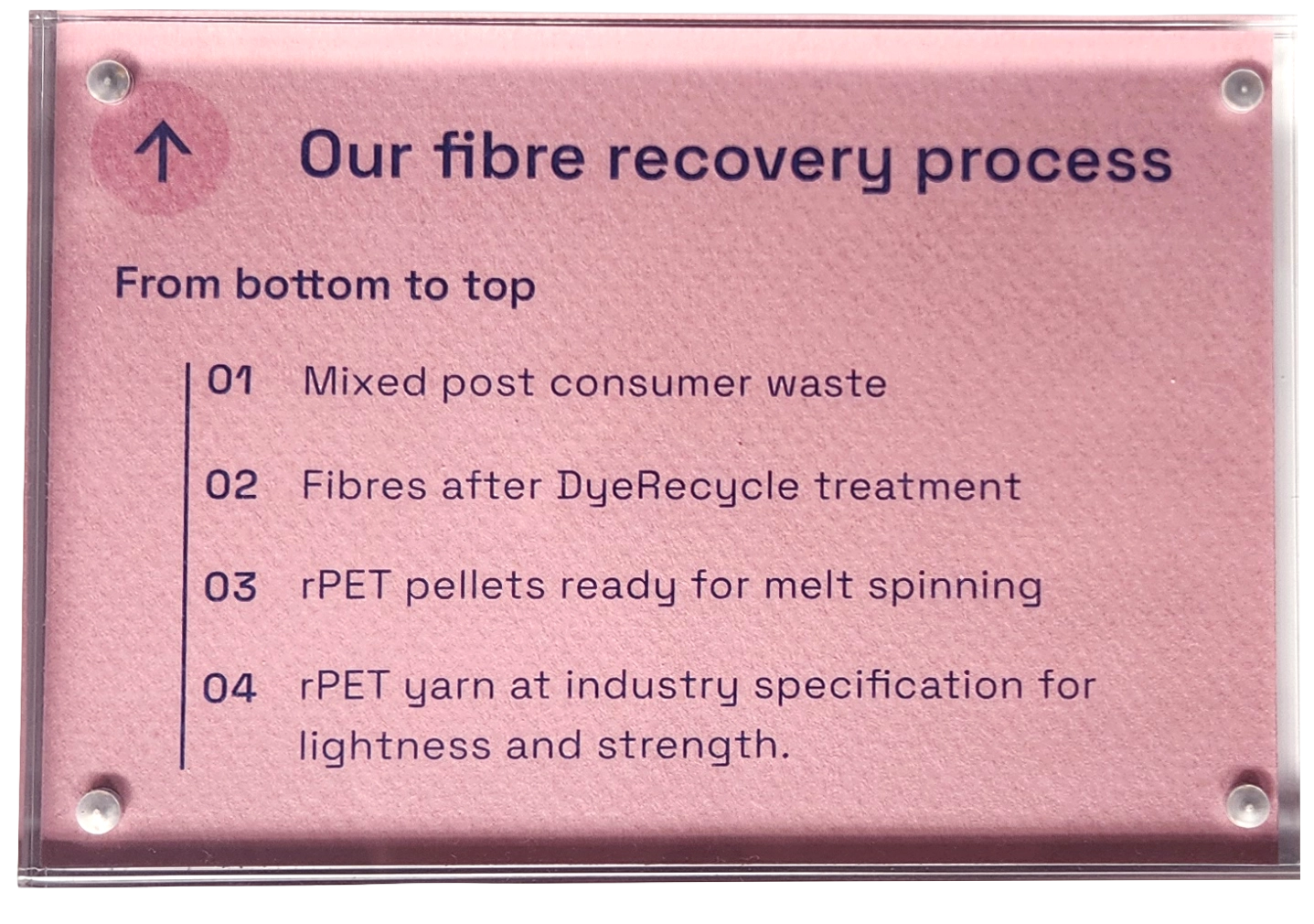
Above: The exhibit signs mimiced museum style standards, with a mixture of technical precision and common descriptive text. Right: My 3D mockup helped reduce anxiety and decision fatique in leadership.

37 degrees, 5,607 attendees, and 3 types of superglue later, DyeRecycle was relaunched into the market, the grand test of 8 months of testing. I spoke to every brand, materials manufacturer, waste sorter, recycler, technologist, researcher, and funder on our carefully curated list, and the team collected more than 80 leads for future collaboration.
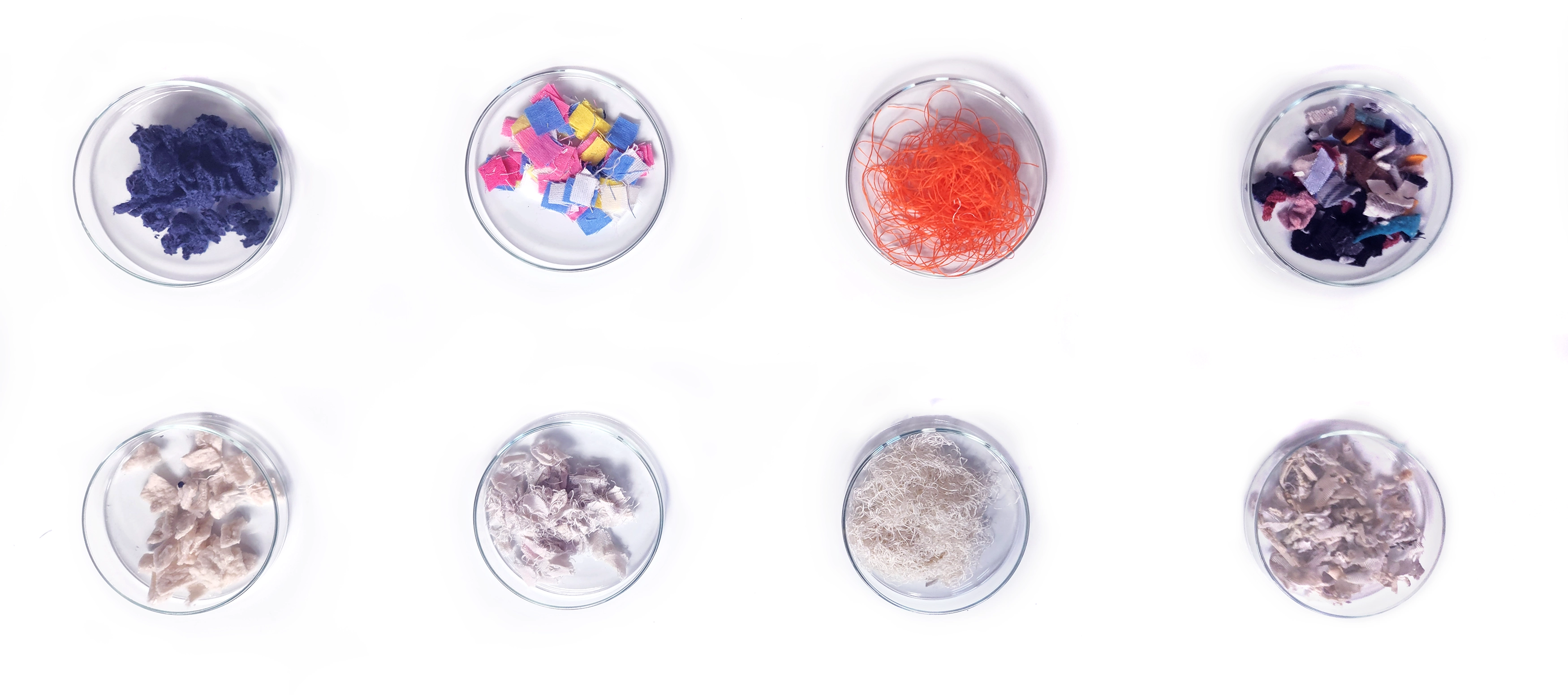
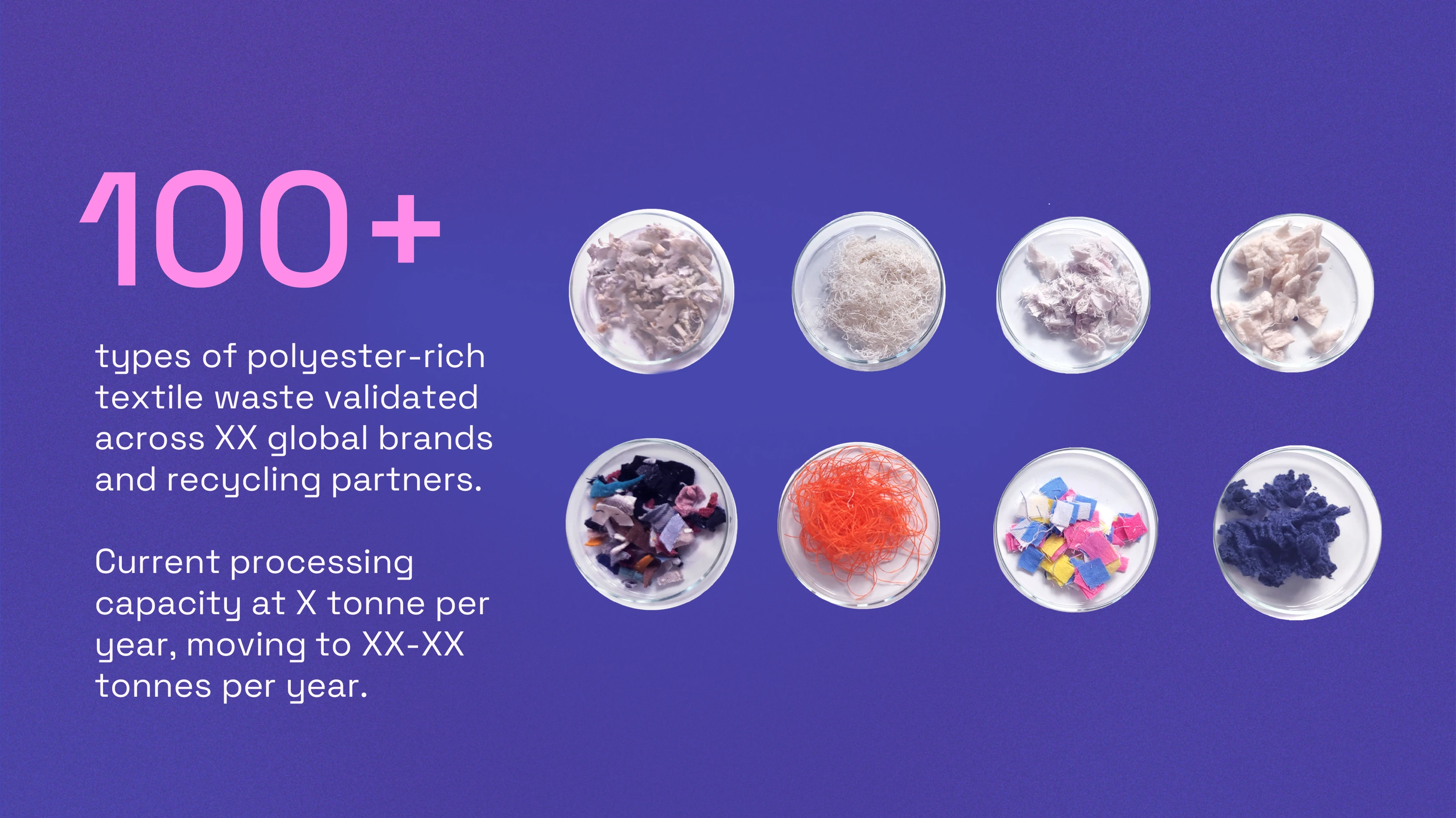
What was most striking was the foundation for conversation. For every question about pilot capacity, time to market, and manufacturing integration, everyone believed the technology. Most people immediately touched the fabric in our ‘before and after dishes’, and the different colors, textures, and types often guided questions of the interaction (win!). It wasn’t faked or manufactured. It was observably simple.


The tower also proved evocative, with people coming to the stand just to take pictures. One rather impatient engineer from a large recycling company had brought his colleague, who I was expecting to put me through the same battery of questions. He looked at me, looked at the fibre ball, and said, “Oh, I get it.” Music to my ears. Each of our scientists had personalised how they described the company, each with their own dazzling factoid or tagline. And for the first time, you could see the ingenuity, the care, and the ambition align as one. That’s a real, human-led brand.
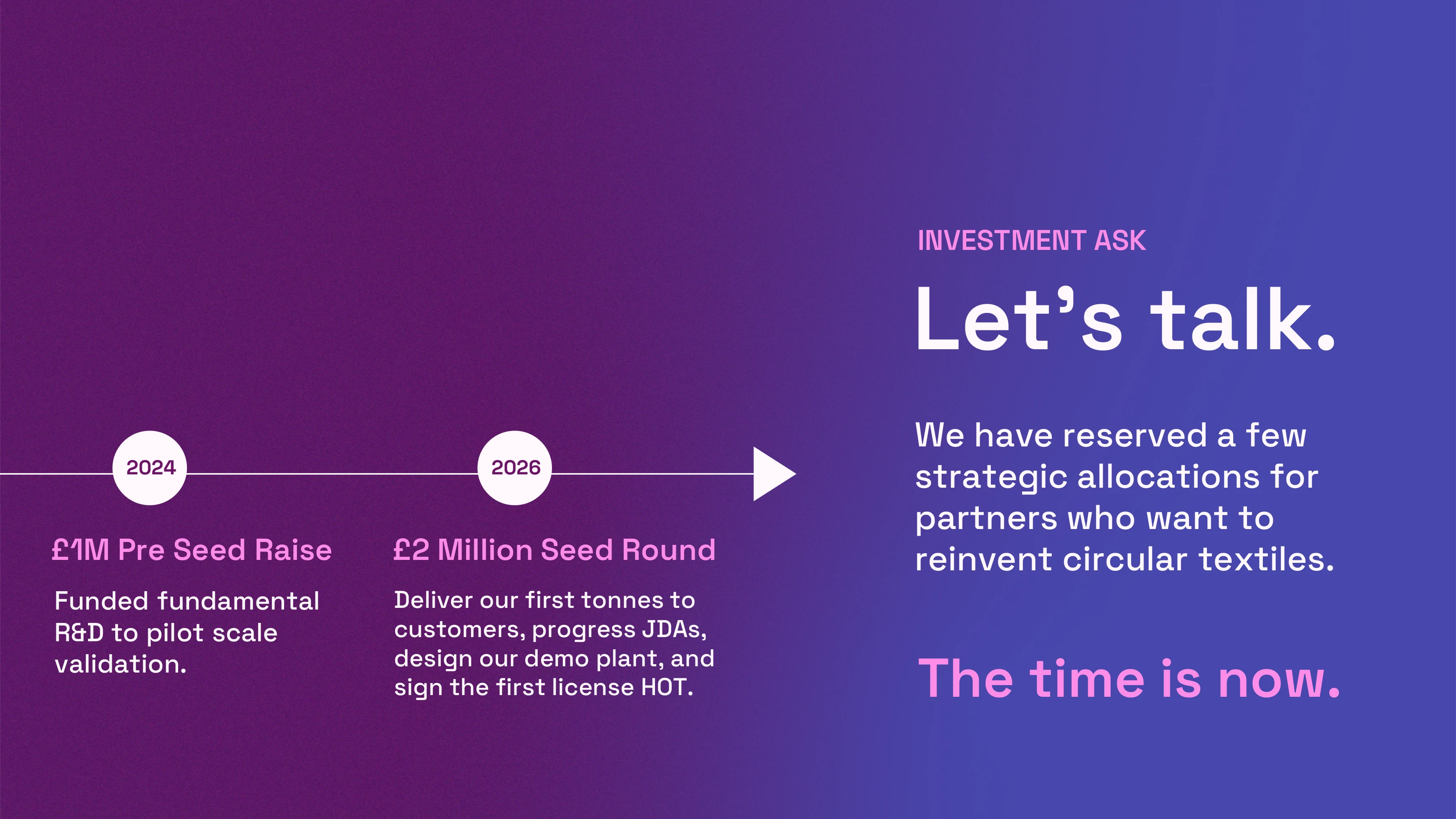
At time of writing, DyeRecycle is soft closing £2 million of its Seed round, after we moved to our first independent lab and started hiring for the final Polymer Chemist. With a platform that finally matches the company maturity, we could return to the dye of it all. I can’t reveal much, but I will say that I relied on multi-linguistics, AI assisted research rabbit holes, and a lot of boggle to create some names worthy of a bold future.
The product will continue to evolve, and there is a reason why the CEO kept rewriting the website even after pencils down. The strategy must be real to the people who bring it to life day in and day out. I can research and validate and craft and design, but a brand, like a company, is only as compelling as the humans it represents.